
2026
LUMINA Pilates
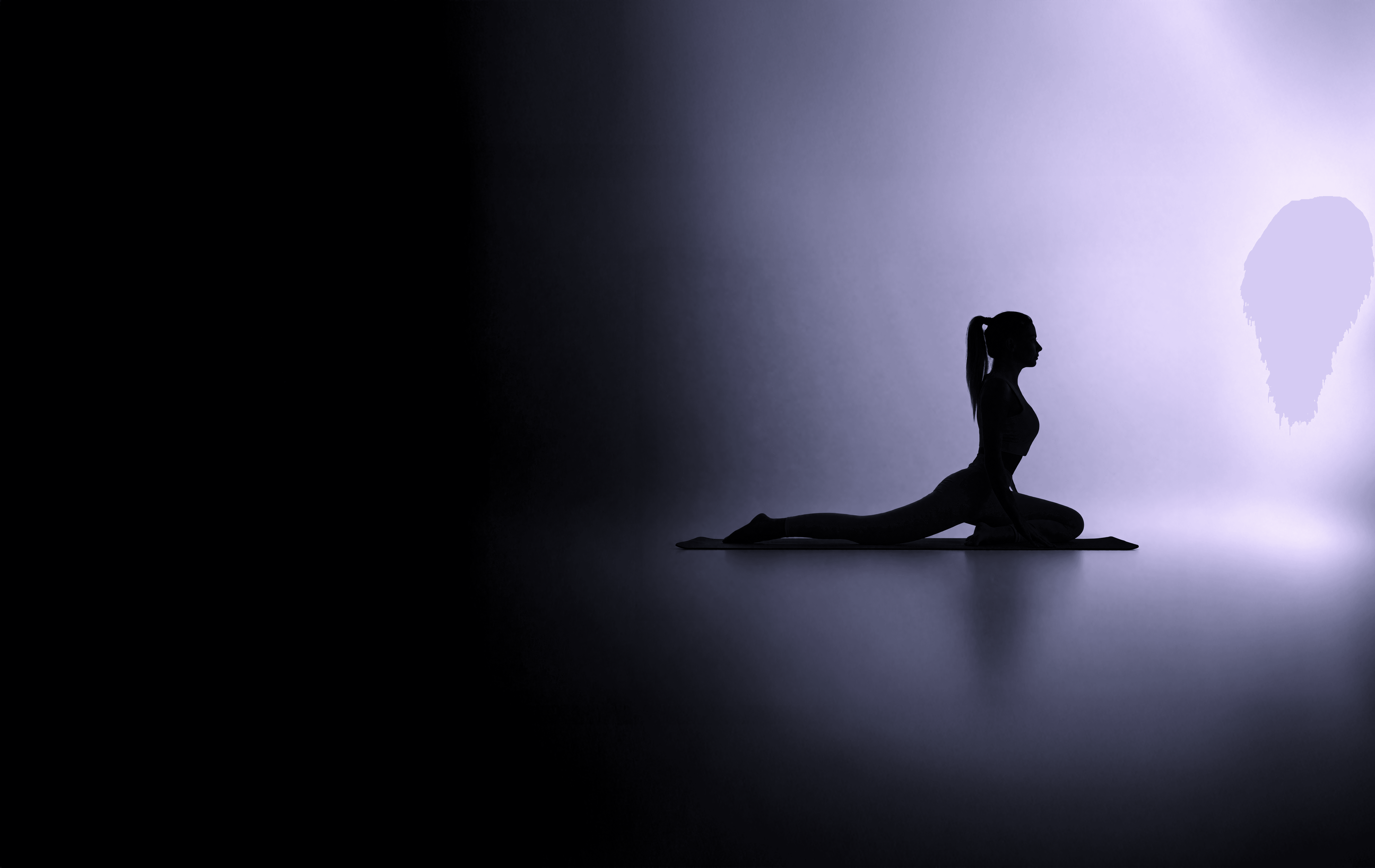
LUMINA Pilates is a movement sanctuary rooted in Swiss-inspired precision — where alignment is strategy, and fitness is not a seasonal trend, but a disciplined pursuit of physical and intellectual longevity.
Brand System
Web Development
Know More
LUMINA — A Study in Stillness, Strategy, and Movement Integrity
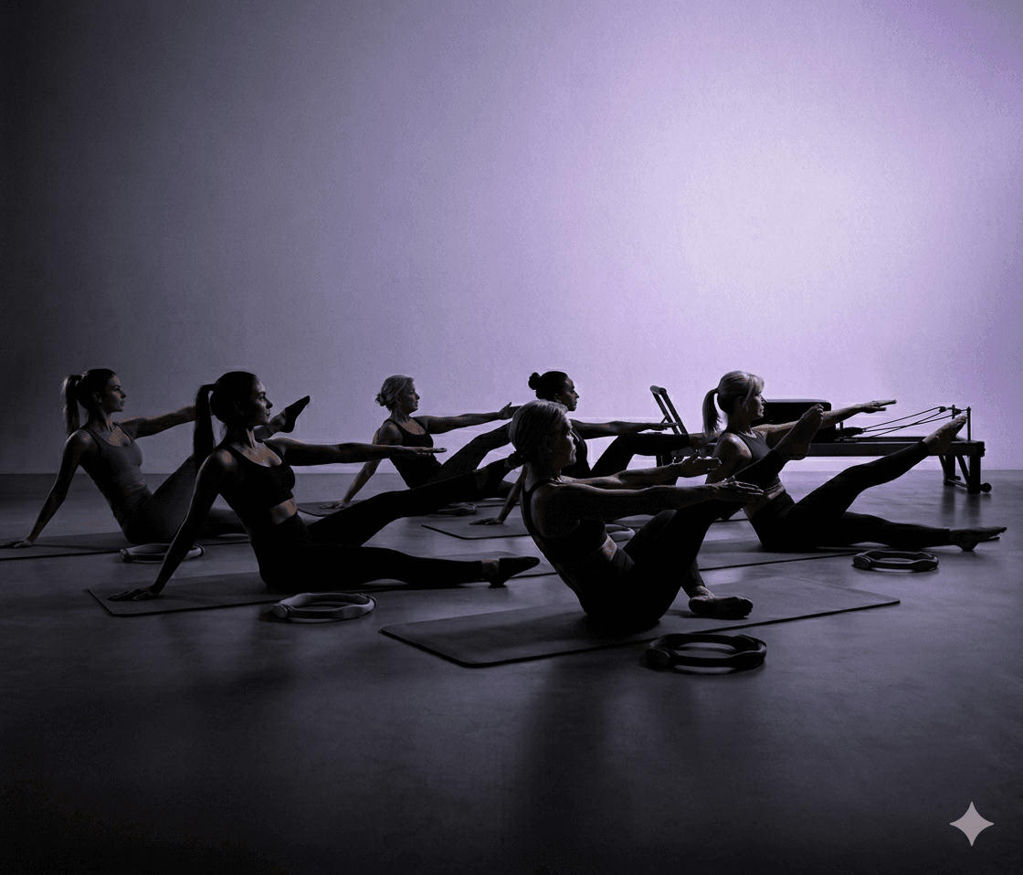
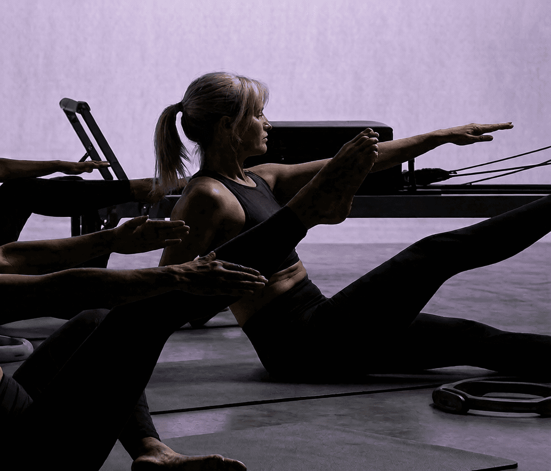
In a wellness landscape dominated by high-intensity noise and fleeting fitness fads, Lumina positions itself as a structural alternative: to prioritize the quality of movement over the quantity of exertion. The brand identity reflects this through a visual language that feels architectural rather than athletic. Every touchpoint—from the editorial typography to the airy, low-contrast imagery—frames the body as a blueprint to be refined rather than a machine to be broken.
The brand mission: To reject trend-driven fitness cycles, crafting a movement experience defined by biomechanical research, structural integrity, and architectural restraint.
The Problem
When Noise Dominates: Reclaiming Clarity Through Precision
The primary challenge was to articulate a wellness philosophy that felt both premium and technically rigorous. Traditional Pilates branding often leans into soft, generic "zen" tropes or aggressive athletic performance. Lumina needed a distinct "visual moat" that reflected its:
Rejection of high-repetition, trend-based workouts.
Obsession with anatomical truth and Swiss design principles.
Commitment to a "sanctuary" environment that fosters mental stillness.
This required a brand expression that was airy but technical, sophisticated but functional, and minimalist but authoritative.
The Solution
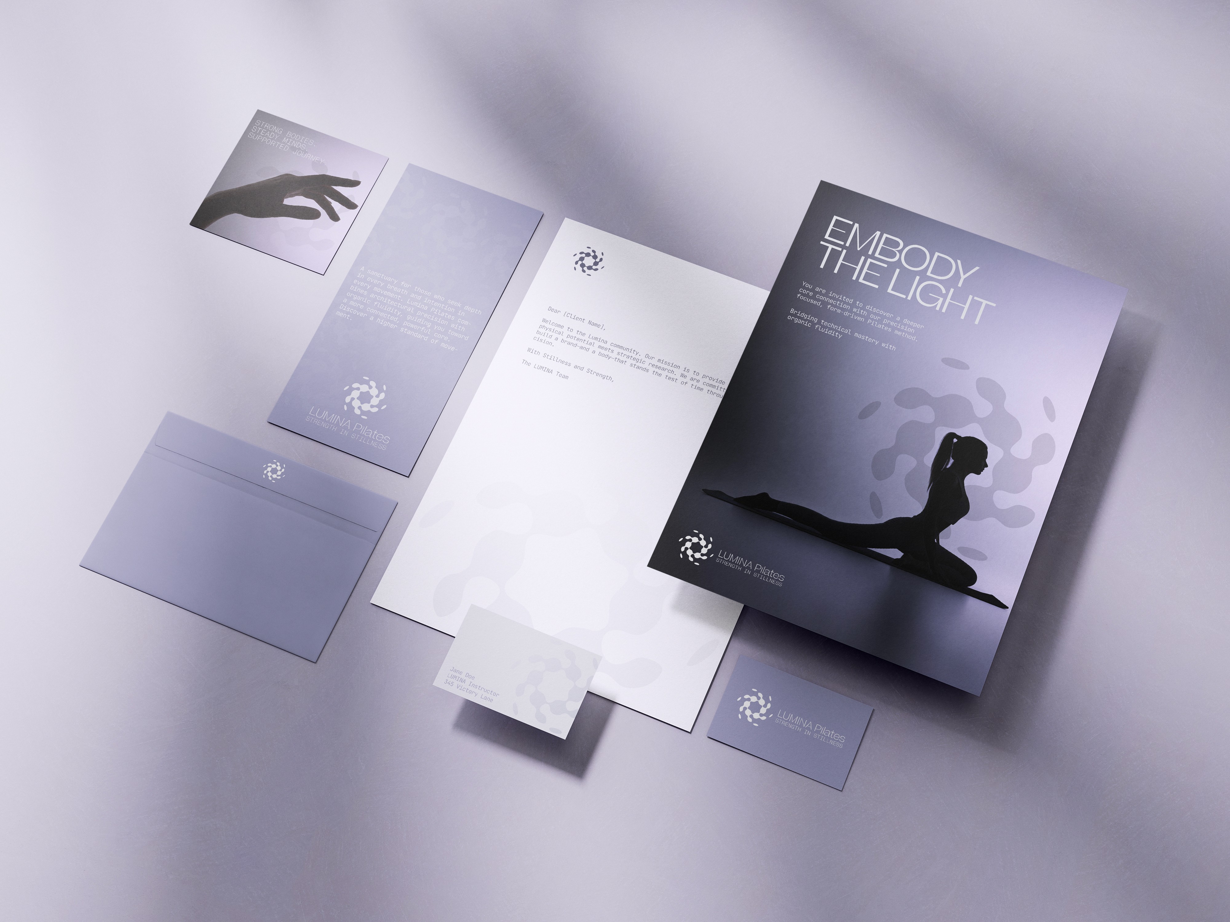
Rebuilding Identity Through Strategic Discovery
1) Brand Narrative The narrative was constructed like a movement thesis: We do not simply offer workouts — we engineer the mechanics of physical longevity. Every headline and FAQ response supports this commitment to technical excellence.
2) Visual Hierarchy The layouts strike a balance between breathable white space and rigorous typographic contrast. We used Swiss-inspired sans-serifs to ground the "airy" photography in a sense of analytical discipline.
3) The Sanctuary Format Framing the studio as a sanctuary—and the initial visit as a Consultation—establishes Lumina as a high-end practice. This strategic positioning moves the brand away from "gym" terminology into the realm of professional movement strategy.
The Lumina Pilates project successfully:
Distilled a complex movement philosophy into an accessible, high-end visual system.
Expressed Pilates as structural engineering for the human body.
Created an editorial aesthetic that frames wellness through technical restraint.
This work demonstrates how rigorous thinking — rooted in the intersection of design and biomechanics — can elevate a wellness brand into a premium lifestyle legacy.

Why It Matters To You
Why Precision Creates Resilience
This project demonstrates my ability to translate a niche philosophy into a cohesive, disciplined brand system—one where every visual decision is rooted in intent and structural truth. For Lumina, the challenge wasn’t about following fitness trends; it was about giving form to a belief system and ensuring the brand could communicate its value to a high-discretion audience.
By defining a strong visual hierarchy and anchoring the brand in "Swiss precision," the project shows how a tightly constructed system can express authority without noise. The result is a brand that feels considered, enduring, and unmistakably purposeful—designed to attract clients who value mastery over momentum.
For you as a potential client, this means you’re partnering with a designer who approaches branding as an architectural exercise. I align strategy, visual language, and technical execution to create identities that are clear, resilient, and built for longevity. Whether you are redefining a studio or launching a new concept, I bring a structured, principle-led approach to ensure your identity stands with conviction.
More Works
©2024

FAQ
01
How does your brand design process work?
02
What's included in your branding packages?
03
Do you also design websites?
04
How long does branding take?
05
What do I need to prepare?
06
Do you offer ongoing support?
07
Can I make tweaks after delivery?
08
How do you ensure my brand stands out from competitors?
Let's Work Together
©2025
Contact Now
Book a discovery call
Let’s create something amazing together! Reach out I’d love to hear about your project and ideas.
2026
LUMINA Pilates
LUMINA Pilates is a movement sanctuary rooted in Swiss-inspired precision — where alignment is strategy, and fitness is not a seasonal trend, but a disciplined pursuit of physical and intellectual longevity.
Brand System
Web Development
Know More
LUMINA — A Study in Stillness, Strategy, and Movement Integrity
In a wellness landscape dominated by high-intensity noise and fleeting fitness fads, Lumina positions itself as a structural alternative: to prioritize the quality of movement over the quantity of exertion. The brand identity reflects this through a visual language that feels architectural rather than athletic. Every touchpoint—from the editorial typography to the airy, low-contrast imagery—frames the body as a blueprint to be refined rather than a machine to be broken.
The brand mission: To reject trend-driven fitness cycles, crafting a movement experience defined by biomechanical research, structural integrity, and architectural restraint.
The Problem
When Noise Dominates: Reclaiming Clarity Through Precision
The primary challenge was to articulate a wellness philosophy that felt both premium and technically rigorous. Traditional Pilates branding often leans into soft, generic "zen" tropes or aggressive athletic performance. Lumina needed a distinct "visual moat" that reflected its:
Rejection of high-repetition, trend-based workouts.
Obsession with anatomical truth and Swiss design principles.
Commitment to a "sanctuary" environment that fosters mental stillness.
This required a brand expression that was airy but technical, sophisticated but functional, and minimalist but authoritative.
The Solution
Rebuilding Identity Through Strategic Discovery
1) Brand Narrative The narrative was constructed like a movement thesis: We do not simply offer workouts — we engineer the mechanics of physical longevity. Every headline and FAQ response supports this commitment to technical excellence.
2) Visual Hierarchy The layouts strike a balance between breathable white space and rigorous typographic contrast. We used Swiss-inspired sans-serifs to ground the "airy" photography in a sense of analytical discipline.
3) The Sanctuary Format Framing the studio as a sanctuary—and the initial visit as a Consultation—establishes Lumina as a high-end practice. This strategic positioning moves the brand away from "gym" terminology into the realm of professional movement strategy.
The Lumina Pilates project successfully:
Distilled a complex movement philosophy into an accessible, high-end visual system.
Expressed Pilates as structural engineering for the human body.
Created an editorial aesthetic that frames wellness through technical restraint.
This work demonstrates how rigorous thinking — rooted in the intersection of design and biomechanics — can elevate a wellness brand into a premium lifestyle legacy.
Why It Matters To You
Why Precision Creates Resilience
This project demonstrates my ability to translate a niche philosophy into a cohesive, disciplined brand system—one where every visual decision is rooted in intent and structural truth. For Lumina, the challenge wasn’t about following fitness trends; it was about giving form to a belief system and ensuring the brand could communicate its value to a high-discretion audience.
By defining a strong visual hierarchy and anchoring the brand in "Swiss precision," the project shows how a tightly constructed system can express authority without noise. The result is a brand that feels considered, enduring, and unmistakably purposeful—designed to attract clients who value mastery over momentum.
For you as a potential client, this means you’re partnering with a designer who approaches branding as an architectural exercise. I align strategy, visual language, and technical execution to create identities that are clear, resilient, and built for longevity. Whether you are redefining a studio or launching a new concept, I bring a structured, principle-led approach to ensure your identity stands with conviction.
More Works
©2024
FAQ
How does your brand design process work?
What's included in your branding packages?
Do you also design websites?
How long does branding take?
What do I need to prepare?
Do you offer ongoing support?
Can I make tweaks after delivery?
How do you ensure my brand stands out from competitors?
Let's Work Together
©2025
Contact Now
Book a
discovery call
Let’s create something amazing together! Reach out I’d love to hear about your project and ideas.