
2025
Skype
Skype is a communication platform that revolutionized the way people connect across the globe. The goal of this rebrand concept was to modernize its visual identity — creating a cohesive and adaptable system that communicates clarity, warmth, and human connection, while remaining instantly recognizable and scalable across digital and physical applications.
Brand Design
Know More
From Calls to Connection: Rebranding Skype for a More Human Digital World
Skype began with a simple mission: to bring people closer together through the power of digital communication. Once a pioneer in online calling, the platform became synonymous with connection itself — bridging distances long before remote work and virtual collaboration became the norm.
But as communication evolved and competitors emerged, Skype’s identity began to feel fragmented — a relic of an earlier internet era rather than a leader in the modern one. The need for a unified, revitalized brand system became clear: one that could restore Skype’s emotional relevance while maintaining the trust and familiarity that defined it for millions.
The challenge was to design an identity that felt human yet modern — one that could carry Skype confidently into a new generation of digital connection.
The Problem
When Familiarity Fades: Reconnecting Skype’s Identity to Its Purpose
As Skype evolved over the years, its visual identity began to lose coherence. The logo appeared in multiple styles, the color palette shifted between updates, and the overall design language no longer reflected the simplicity and trust the brand was known for. What was once a symbol of effortless communication had become visually cluttered and inconsistent.
Without a cohesive system, every interface update or marketing asset risked feeling disconnected from the core brand. For a platform built on clarity and connection, that inconsistency wasn’t just aesthetic — it weakened recognition, trust, and emotional resonance.


The Solution
A New Voice for Modern Communication
To restore clarity and modernize its presence, Skype’s brand was reimagined from the ground up with a unified visual system. The refreshed logo embraces a simplified, circular form that symbolizes connection and clarity, while a refined wordmark ensures seamless scalability across digital and physical touchpoints. A focused color palette of sky blue, navy, and white reinforces the brand’s core values of trust, simplicity, and human connection.
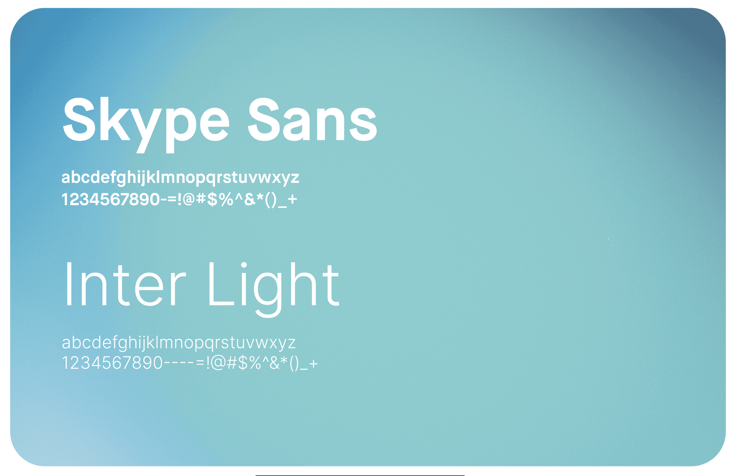
Typography was standardized with Trojan Pro for headlines and Inter for digital text—balancing warmth with precision and ensuring readability across interfaces and devices. Every asset—from social posts and UI elements to presentation decks and icons—was restructured to maintain visual coherence and ease of recognition.
The result is a brand identity that feels fresh, human, and unmistakably Skype—a visual language built to connect people effortlessly, wherever they are in the world.

Why It Matters To You
Designing Connection That Scales
This project showcases my ability to reimagine an established brand for today’s digital landscape—balancing heritage, clarity, and modern relevance. For Skype, the challenge went beyond visual refresh; it was about restoring coherence to a global icon while aligning every design decision with function and emotion.
By refining the visual language, systematizing color and type, and modernizing how the brand lives across platforms, the rebrand demonstrates how thoughtful design can strengthen recognition and user trust in a cluttered market.
As a potential client, this means you’re not just getting a designer who can make things look clean—you’re getting a strategic partner who understands how design systems build clarity, cohesion, and long-term brand value. Whether your brand needs a modern refresh or a complete redefinition, I bring the same systematic approach that helped transform Skype into a clearer, more connected identity.
More Works
©2024

FAQ
01
How does your brand design process work?
02
What's included in your branding packages?
03
Do you also design websites?
04
How long does branding take?
05
What do I need to prepare?
06
Do you offer ongoing support?
07
Can I make tweaks after delivery?
08
How do you ensure my brand stands out from competitors?
Let's Work Together
©2025
Contact Now
Book a discovery call
Let’s create something amazing together! Reach out I’d love to hear about your project and ideas.
2025
Skype
Skype is a communication platform that revolutionized the way people connect across the globe. The goal of this rebrand concept was to modernize its visual identity — creating a cohesive and adaptable system that communicates clarity, warmth, and human connection, while remaining instantly recognizable and scalable across digital and physical applications.
Brand Design
Know More
From Calls to Connection: Rebranding Skype for a More Human Digital World
Skype began with a simple mission: to bring people closer together through the power of digital communication. Once a pioneer in online calling, the platform became synonymous with connection itself — bridging distances long before remote work and virtual collaboration became the norm.
But as communication evolved and competitors emerged, Skype’s identity began to feel fragmented — a relic of an earlier internet era rather than a leader in the modern one. The need for a unified, revitalized brand system became clear: one that could restore Skype’s emotional relevance while maintaining the trust and familiarity that defined it for millions.
The challenge was to design an identity that felt human yet modern — one that could carry Skype confidently into a new generation of digital connection.
The Problem
When Familiarity Fades: Reconnecting Skype’s Identity to Its Purpose
As Skype evolved over the years, its visual identity began to lose coherence. The logo appeared in multiple styles, the color palette shifted between updates, and the overall design language no longer reflected the simplicity and trust the brand was known for. What was once a symbol of effortless communication had become visually cluttered and inconsistent.
Without a cohesive system, every interface update or marketing asset risked feeling disconnected from the core brand. For a platform built on clarity and connection, that inconsistency wasn’t just aesthetic — it weakened recognition, trust, and emotional resonance.
The Solution
A New Voice for Modern Communication
To restore clarity and modernize its presence, Skype’s brand was reimagined from the ground up with a unified visual system. The refreshed logo embraces a simplified, circular form that symbolizes connection and clarity, while a refined wordmark ensures seamless scalability across digital and physical touchpoints. A focused color palette of sky blue, navy, and white reinforces the brand’s core values of trust, simplicity, and human connection.
Typography was standardized with Trojan Pro for headlines and Inter for digital text—balancing warmth with precision and ensuring readability across interfaces and devices. Every asset—from social posts and UI elements to presentation decks and icons—was restructured to maintain visual coherence and ease of recognition.
The result is a brand identity that feels fresh, human, and unmistakably Skype—a visual language built to connect people effortlessly, wherever they are in the world.
Why It Matters To You
Designing Connection That Scales
This project showcases my ability to reimagine an established brand for today’s digital landscape—balancing heritage, clarity, and modern relevance. For Skype, the challenge went beyond visual refresh; it was about restoring coherence to a global icon while aligning every design decision with function and emotion.
By refining the visual language, systematizing color and type, and modernizing how the brand lives across platforms, the rebrand demonstrates how thoughtful design can strengthen recognition and user trust in a cluttered market.
As a potential client, this means you’re not just getting a designer who can make things look clean—you’re getting a strategic partner who understands how design systems build clarity, cohesion, and long-term brand value. Whether your brand needs a modern refresh or a complete redefinition, I bring the same systematic approach that helped transform Skype into a clearer, more connected identity.
More Works
©2024
FAQ
How does your brand design process work?
What's included in your branding packages?
Do you also design websites?
How long does branding take?
What do I need to prepare?
Do you offer ongoing support?
Can I make tweaks after delivery?
How do you ensure my brand stands out from competitors?
Let's Work Together
©2025
Contact Now
Book a
discovery call
Let’s create something amazing together! Reach out I’d love to hear about your project and ideas.