
2025
DJs of Montreal
DJs of Montreal began as a humble Instagram page aiming to spotlight local DJs. Fast forward three years, it has transformed into the go-to community hub for discovering, supporting, and celebrating Montreal’s DJ scene. Our goal with the brand was to design a bold, modern identity that feels at home both in nightclubs and digital spaces — something that’s distinctly Montreal and unapologetically music-forward.
Branding
Logo Design
Know More
From Community Roots to Cultural Identity: Designing a Brand that Resonates with the Rhythm of Montreal
DJs of Montreal began as a grassroots Instagram page with a simple mission: showcase local DJs and connect people through music. In just a few years, it evolved into one of the city’s most active community platforms for nightlife culture, championing underground events, emerging talent, and a growing audience of listeners. As the project matured, so did the need for a visual identity that could capture its essence — something that could live as naturally on a rooftop set poster as it could on a story highlight or a merch drop. The brand needed to feel rooted in the city, reflective of the culture, and flexible enough to evolve alongside its community.

Problem
A Growing Brand with No Visual Backbone
Despite its popularity, DJs of Montreal lacked a cohesive brand identity. The platform had reach, recognition, and a loyal following, but visually, it lacked unity. Posts, flyers, and promotions were inconsistent. There was no recognizable symbol that audiences could associate with the name, no design system to create continuity across platforms, and no visual language to tie it all back to the city’s energy.
The brand’s growth had outpaced its design — and with bigger collaborations, live events, and media content on the horizon, the visual side of the project needed to level up. What was once a casual community page now needed a formal identity that still felt informal — a system that could balance structure and soul.
Solution
A Bold Identity Rooted in Rhythm and Place
The new identity drew inspiration directly from Montreal’s civic symbols while reinterpreting them through the lens of DJ culture. The custom symbol was based on the city’s iconic floral emblem — a four-part cross — but was reimagined with circular loops, echoing vinyl records and the rhythm of live mixing. These four loops represent the pillars of the local scene: artists, venues, listeners, and culture. The mark creates a feeling of motion and unity, anchoring the visual identity while leaving space for creative expansion.
Color choices reflected both minimalism and cultural specificity. A black-and-white foundation gave the brand flexibility and boldness, while accents of MTL blue and Festival red infused a sense of place and personality. Typography played a key role: Druk Wide added a bold, assertive tone for headlines and event materials, while Inter brought clarity and balance to bios, descriptions, and social captions.
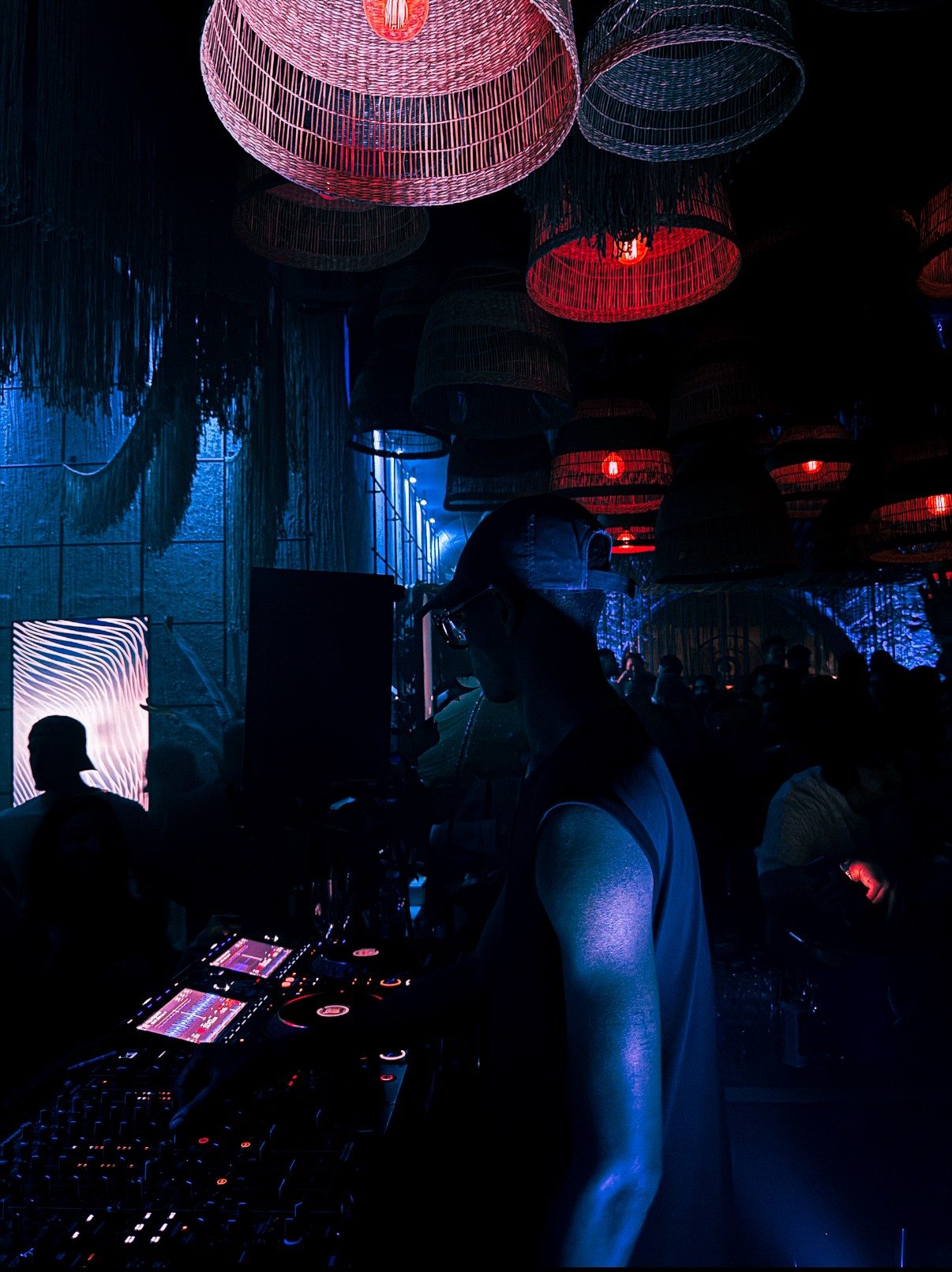
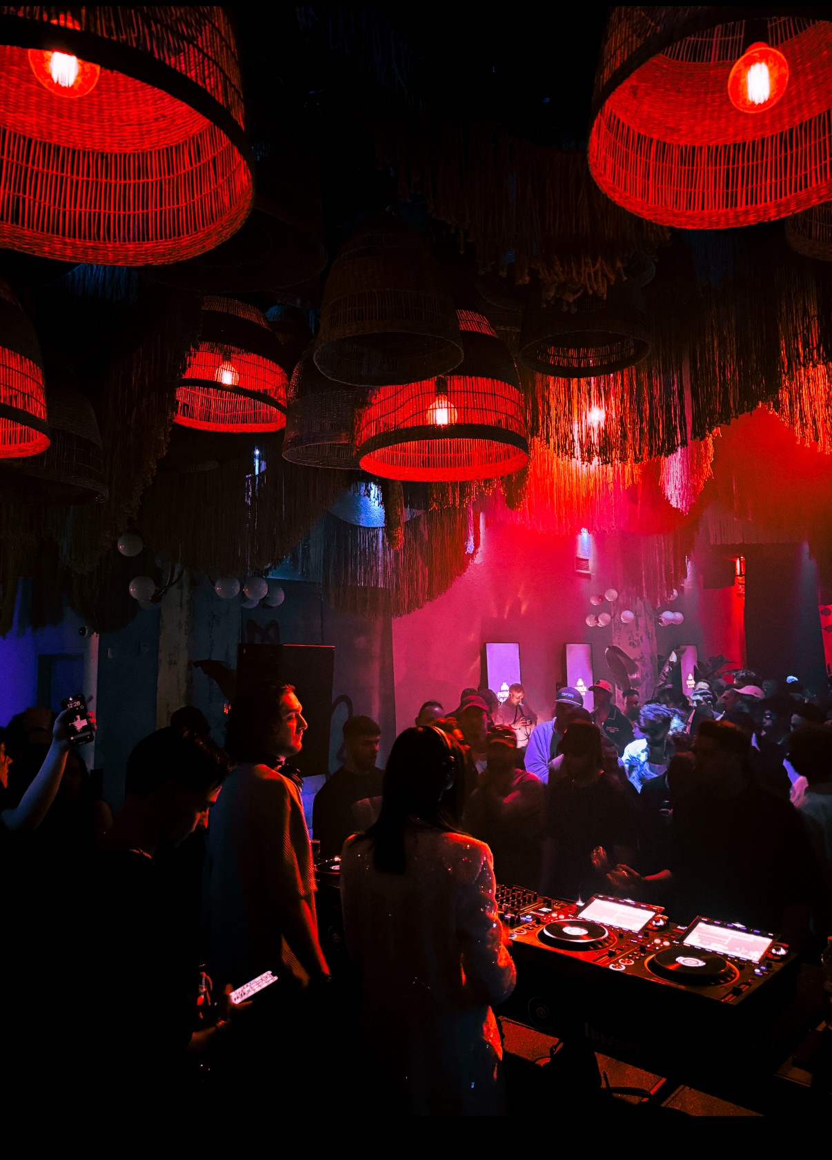
Visually, the brand was designed to live where the scene does — in dark clubs, on urban rooftops, and in the glow of LED lighting. The photography direction focused on high-energy nightlife scenes, real venues, and local textures. Everything from the tone of voice to the editing style aimed to capture Montreal’s underground spirit — raw, rhythmic, and alive. This wasn’t a polished corporate identity. It was a grounded, expressive system built to scale with community momentum.

Why It Matters To You
How Strategic Branding Turns Movement Into Memory
For community-led brands, a strong identity is more than just a logo — it’s how people connect, recognize, and rally around something bigger than themselves. DJs of Montreal is proof that grassroots energy, when paired with strategic branding, can evolve into a cultural emblem. What started as a passion project became a recognizable movement — not just because of what it offered, but because of how it looked, felt, and spoke to its audience.
Prospective clients often come to us when their growth starts to outpace their visuals. They know what they’re building has value — but they need that value to be seen, felt, and remembered. This project shows how we take what’s already there — the energy, the story, the community — and turn it into a brand that’s ready for more. If you're building something meaningful and want your identity to match its momentum, this is what we can build together.

More Works
©2024

FAQ
01
How does your brand design process work?
02
What's included in your branding packages?
03
Do you also design websites?
04
How long does branding take?
05
What do I need to prepare?
06
Do you offer ongoing support?
07
Can I make tweaks after delivery?
08
How do you ensure my brand stands out from competitors?
Let's Work Together
©2025
Contact Now
Book a discovery call
Let’s create something amazing together! Reach out I’d love to hear about your project and ideas.
2025
DJs of Montreal
DJs of Montreal began as a humble Instagram page aiming to spotlight local DJs. Fast forward three years, it has transformed into the go-to community hub for discovering, supporting, and celebrating Montreal’s DJ scene. Our goal with the brand was to design a bold, modern identity that feels at home both in nightclubs and digital spaces — something that’s distinctly Montreal and unapologetically music-forward.
Branding
Logo Design
Know More
From Community Roots to Cultural Identity: Designing a Brand that Resonates with the Rhythm of Montreal
DJs of Montreal began as a grassroots Instagram page with a simple mission: showcase local DJs and connect people through music. In just a few years, it evolved into one of the city’s most active community platforms for nightlife culture, championing underground events, emerging talent, and a growing audience of listeners. As the project matured, so did the need for a visual identity that could capture its essence — something that could live as naturally on a rooftop set poster as it could on a story highlight or a merch drop. The brand needed to feel rooted in the city, reflective of the culture, and flexible enough to evolve alongside its community.
Problem
A Growing Brand with No Visual Backbone
Despite its popularity, DJs of Montreal lacked a cohesive brand identity. The platform had reach, recognition, and a loyal following, but visually, it lacked unity. Posts, flyers, and promotions were inconsistent. There was no recognizable symbol that audiences could associate with the name, no design system to create continuity across platforms, and no visual language to tie it all back to the city’s energy.
The brand’s growth had outpaced its design — and with bigger collaborations, live events, and media content on the horizon, the visual side of the project needed to level up. What was once a casual community page now needed a formal identity that still felt informal — a system that could balance structure and soul.
Solution
A Bold Identity Rooted in Rhythm and Place
The new identity drew inspiration directly from Montreal’s civic symbols while reinterpreting them through the lens of DJ culture. The custom symbol was based on the city’s iconic floral emblem — a four-part cross — but was reimagined with circular loops, echoing vinyl records and the rhythm of live mixing. These four loops represent the pillars of the local scene: artists, venues, listeners, and culture. The mark creates a feeling of motion and unity, anchoring the visual identity while leaving space for creative expansion.
Color choices reflected both minimalism and cultural specificity. A black-and-white foundation gave the brand flexibility and boldness, while accents of MTL blue and Festival red infused a sense of place and personality. Typography played a key role: Druk Wide added a bold, assertive tone for headlines and event materials, while Inter brought clarity and balance to bios, descriptions, and social captions.
Visually, the brand was designed to live where the scene does — in dark clubs, on urban rooftops, and in the glow of LED lighting. The photography direction focused on high-energy nightlife scenes, real venues, and local textures. Everything from the tone of voice to the editing style aimed to capture Montreal’s underground spirit — raw, rhythmic, and alive. This wasn’t a polished corporate identity. It was a grounded, expressive system built to scale with community momentum.
Why It Matters To You
How Strategic Branding Turns Movement Into Memory
For community-led brands, a strong identity is more than just a logo — it’s how people connect, recognize, and rally around something bigger than themselves. DJs of Montreal is proof that grassroots energy, when paired with strategic branding, can evolve into a cultural emblem. What started as a passion project became a recognizable movement — not just because of what it offered, but because of how it looked, felt, and spoke to its audience.
Prospective clients often come to us when their growth starts to outpace their visuals. They know what they’re building has value — but they need that value to be seen, felt, and remembered. This project shows how we take what’s already there — the energy, the story, the community — and turn it into a brand that’s ready for more. If you're building something meaningful and want your identity to match its momentum, this is what we can build together.
More Works
©2024
FAQ
How does your brand design process work?
What's included in your branding packages?
Do you also design websites?
How long does branding take?
What do I need to prepare?
Do you offer ongoing support?
Can I make tweaks after delivery?
How do you ensure my brand stands out from competitors?
Let's Work Together
©2025
Contact Now
Book a
discovery call
Let’s create something amazing together! Reach out I’d love to hear about your project and ideas.