2025
APEX Motion
APEX MOTION is a performance-driven brand concept that lives at the intersection of fitness, technology, and modern lifestyle. Created to reflect both physical and personal progression, the brand identity embodies the spirit of ambition and movement. With a name that fuses the ideas of reaching one’s peak ("Apex") and continuous momentum ("Motion"), the goal was to develop a design system that feels bold, focused, and future-ready.
Branding
Logo Design
Know More
Scope of Work – Designing a Complete Identity System with Real-World Impact
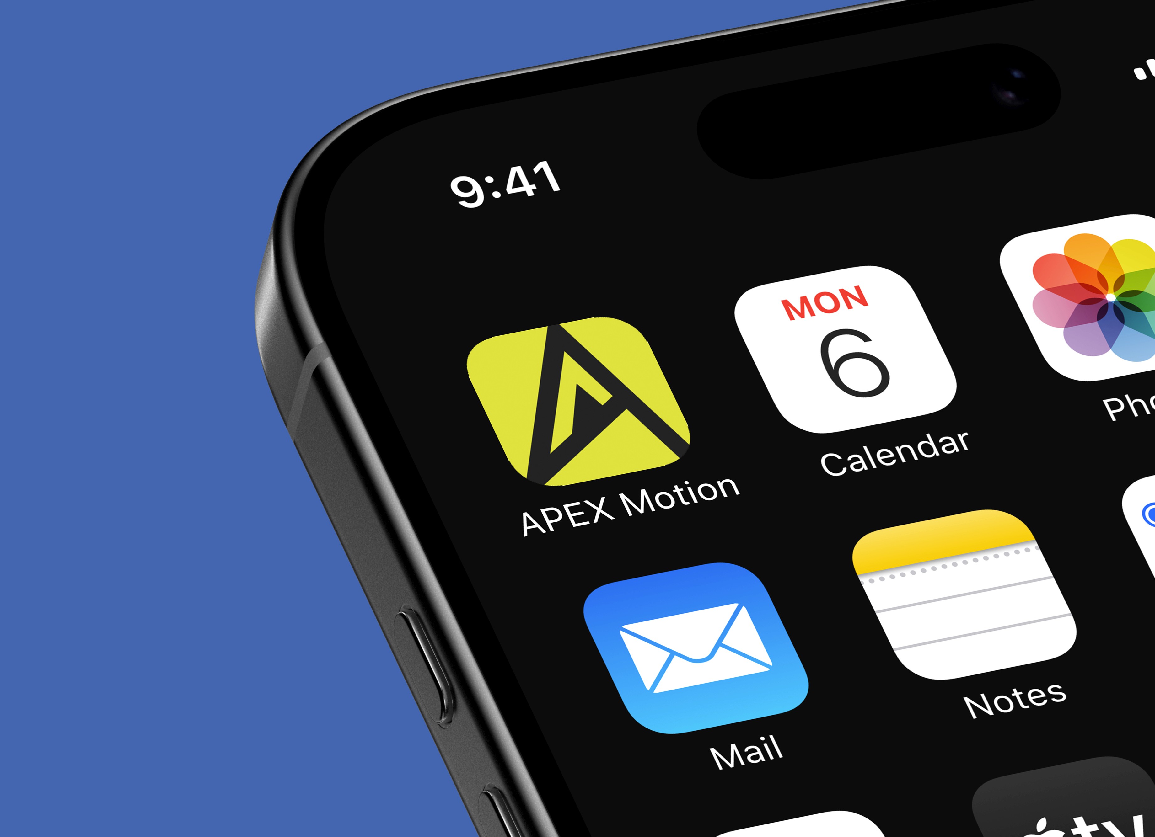
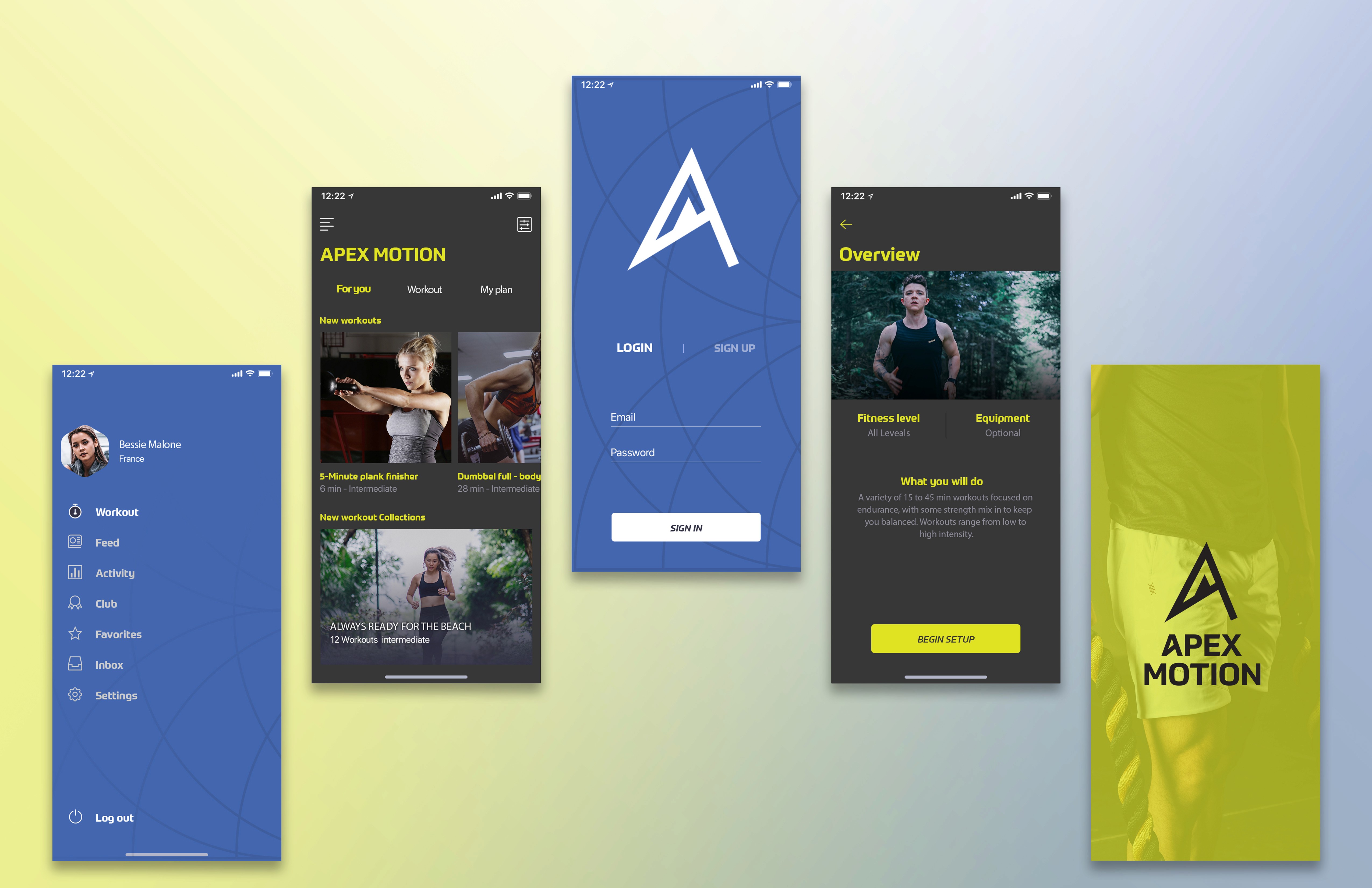
The project scope included a complete brand identity development: a primary and secondary logo system, a bold geometric typeface selection, a distinctive color palette, an adaptable visual pattern, and real-world brand applications across digital and physical platforms. Deliverables included mockups for mobile app interfaces, branded merchandise such as caps, and a visual system guide that ensures consistency across future touchpoints.
Problem
Brand Challenge – Addressing a Market Saturated with Generic Visuals and a Lack of a Connection
The problem identified was the saturation of the fitness and performance space with uninspired, overused visual clichés—generic icons, aggressive fonts, and color schemes that lacked personality or adaptability. Most existing brands focused heavily on brute strength or sterile tech aesthetics. There was a clear opportunity to carve a unique visual voice for a brand that champions precision, progress, and elevation, appealing to users who are equally focused on performance and personal growth.
Solution
Strategic Solution – Creating a Symbol That Captures Aspiration, Direction, and Energy
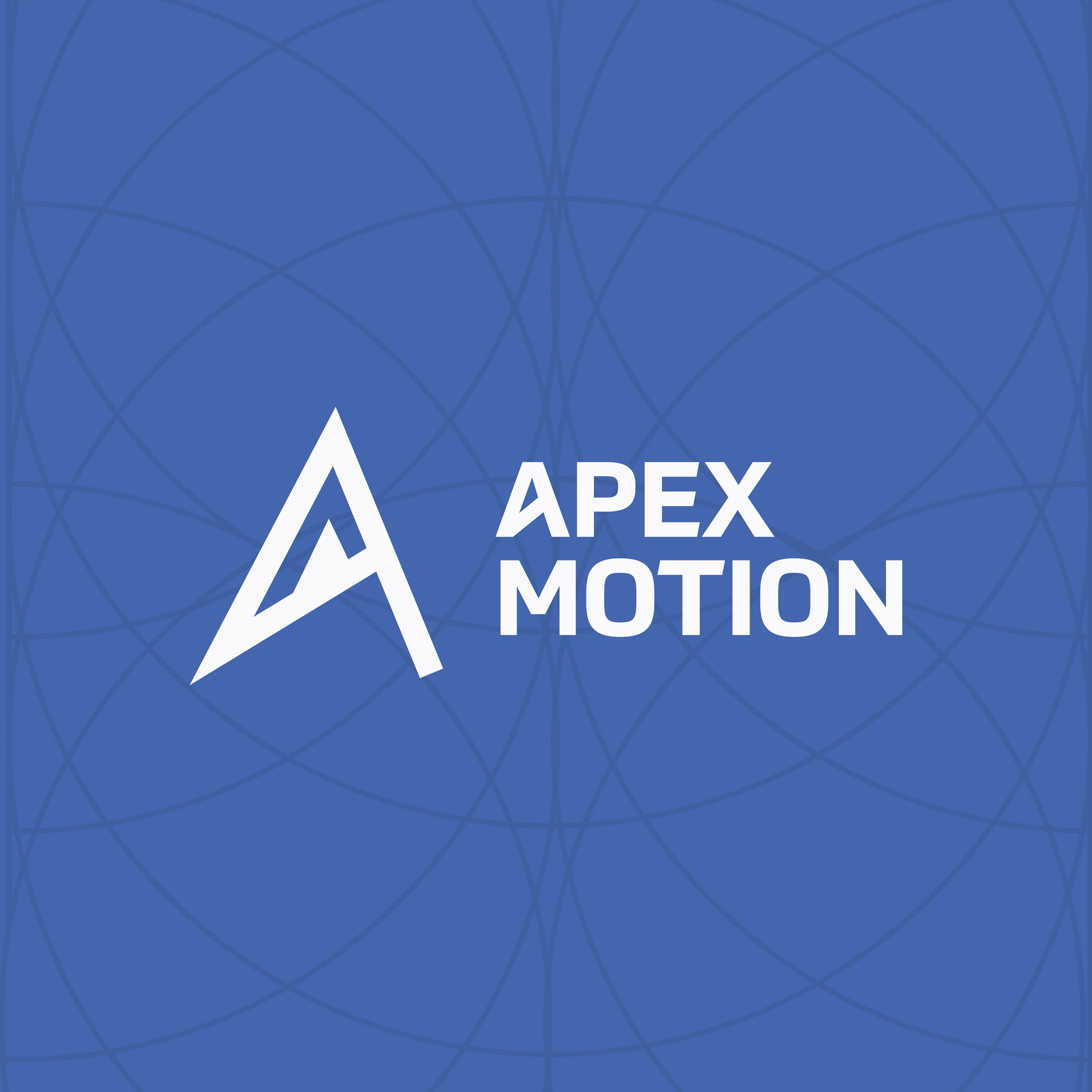
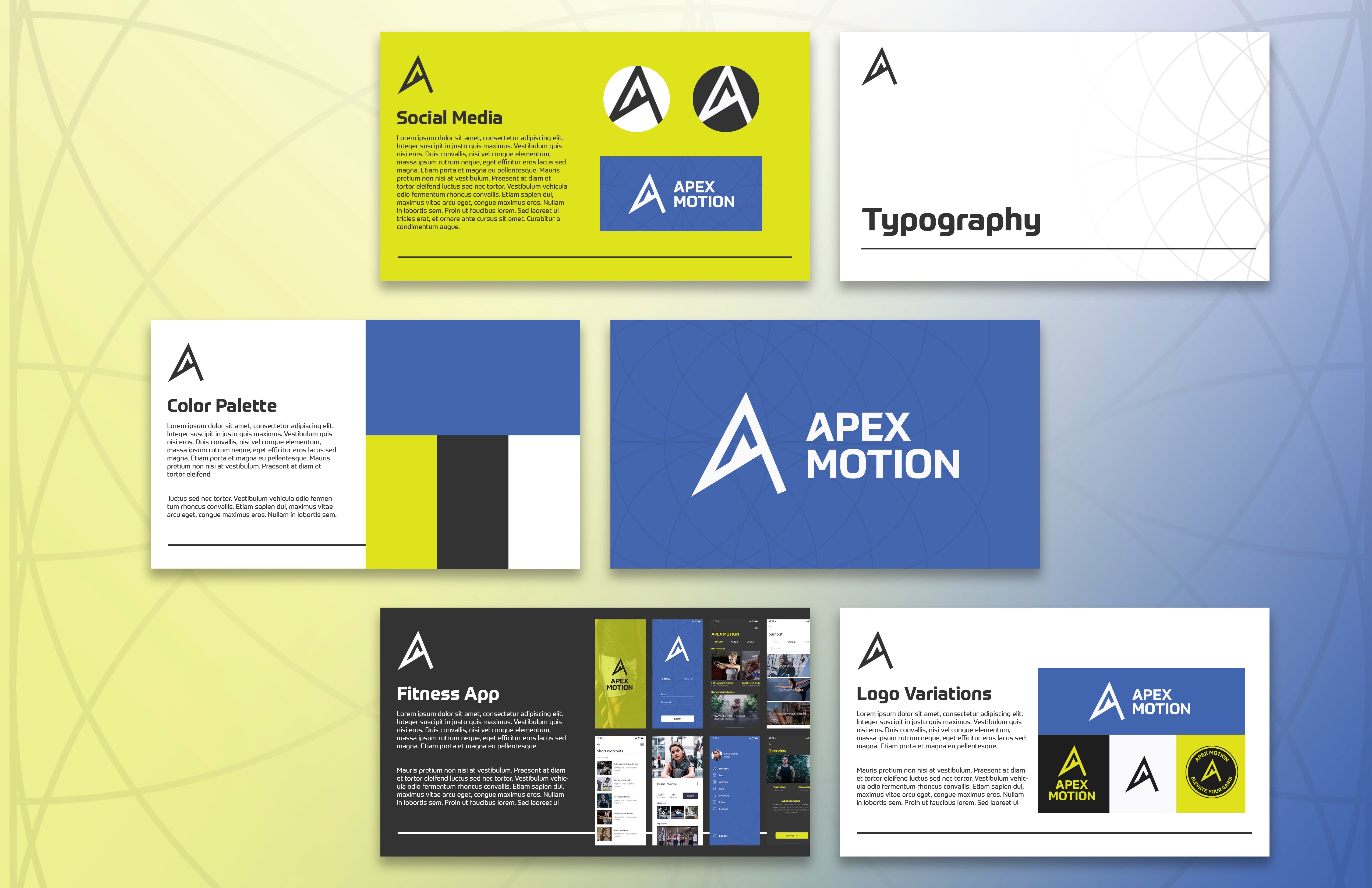
The proposed solution was a dynamic and highly versatile identity system anchored by a custom "A" monogram. This letterform doubles as a visual metaphor: a rising peak and an arrow, suggesting direction, energy, and upward motion. It’s instantly recognizable, scalable, and legible across sizes and formats. The surrounding type treatment balances this symbol with a structured, modern font that reinforces the brand’s emphasis on discipline and drive.
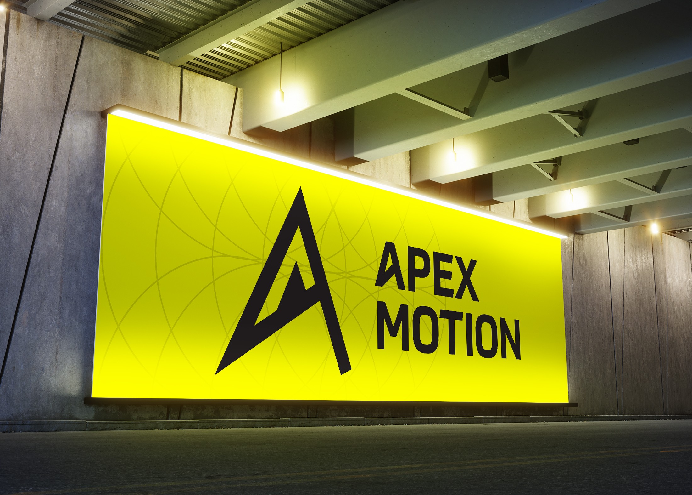
The color palette of electric yellow and cool blue was chosen to inject energy while maintaining a professional and clean tone. Yellow conveys activity, alertness, and motivation—perfect for a performance brand—while blue adds a layer of trust and tech appeal. The pattern design, based on circular symmetry and geometry, adds a layer of visual storytelling: it reflects the inner structure and rhythm found in both physical training and personal development.
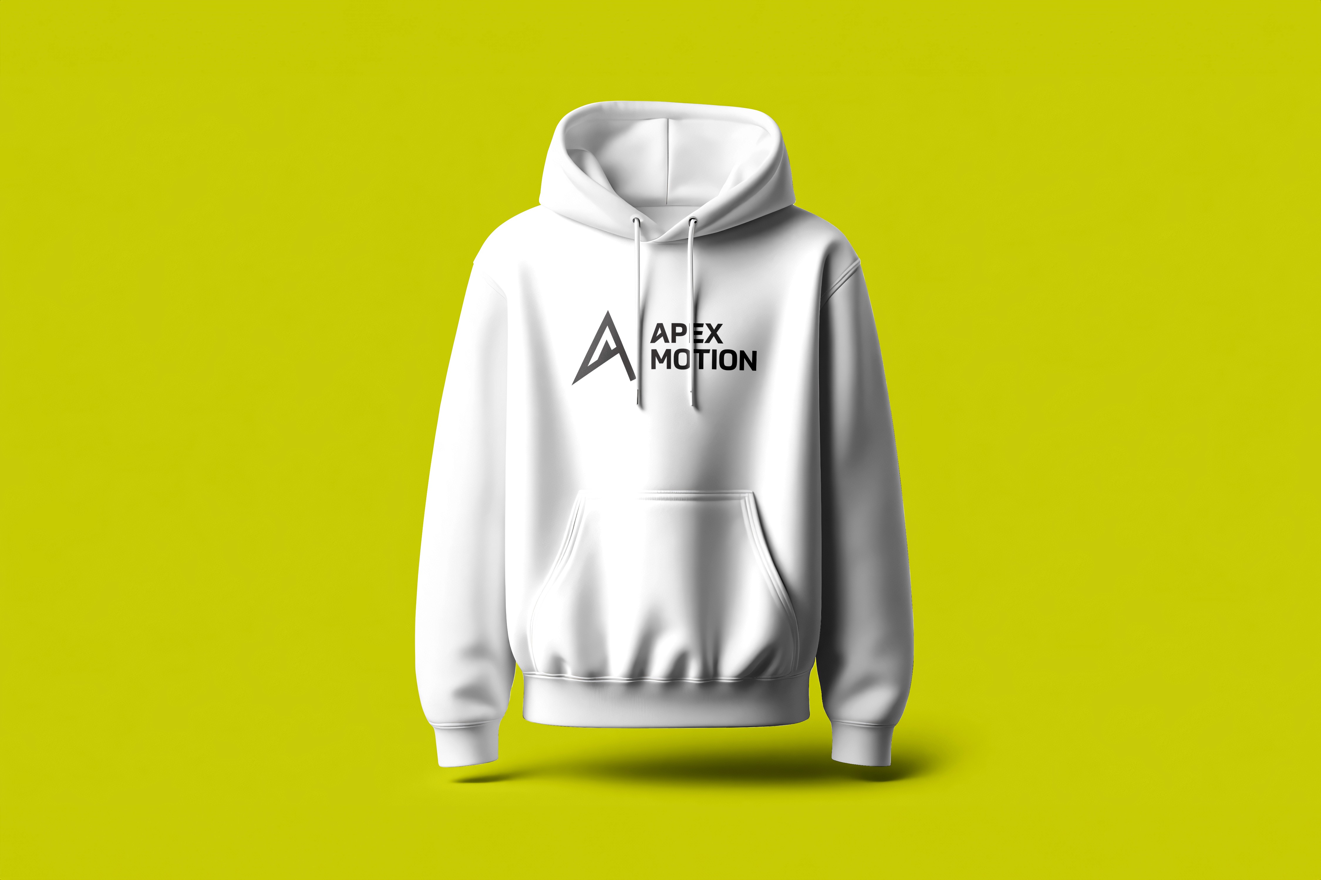
This identity was further tested through mockups, including a mobile app icon that maintains legibility and impact even at small sizes, and an embroidered cap design that showcases the mark’s elegance and strength in lifestyle apparel.
Why It Matters To You
Client Takeaway – A Smart, Scalable Identity Built for Growth and Real-World Connection
For a new client reviewing this project, what sets APEX MOTION apart is its strategic clarity, visual boldness, and multi-environment adaptability. It’s not just a logo—it’s a system built to evolve with the brand as it grows into apps, merchandise, wearables, and content. It proves that performance branding can be sleek, intelligent, and emotionally resonant—qualities every future-facing business needs to thrive in a competitive market.
More Works
©2024

FAQ
01
How does your brand design process work?
02
What's included in your branding packages?
03
Do you also design websites?
04
How long does branding take?
05
What do I need to prepare?
06
Do you offer ongoing support?
07
Can I make tweaks after delivery?
08
How do you ensure my brand stands out from competitors?
Let's Work Together
©2025
Contact Now
Book a discovery call
Let’s create something amazing together! Reach out I’d love to hear about your project and ideas.
2025
APEX Motion
APEX MOTION is a performance-driven brand concept that lives at the intersection of fitness, technology, and modern lifestyle. Created to reflect both physical and personal progression, the brand identity embodies the spirit of ambition and movement. With a name that fuses the ideas of reaching one’s peak ("Apex") and continuous momentum ("Motion"), the goal was to develop a design system that feels bold, focused, and future-ready.
Branding
Logo Design
Know More
Scope of Work – Designing a Complete Identity System with Real-World Impact
The project scope included a complete brand identity development: a primary and secondary logo system, a bold geometric typeface selection, a distinctive color palette, an adaptable visual pattern, and real-world brand applications across digital and physical platforms. Deliverables included mockups for mobile app interfaces, branded merchandise such as caps, and a visual system guide that ensures consistency across future touchpoints.
Problem
Brand Challenge – Addressing a Market Saturated with Generic Visuals and a Lack of a Connection
The problem identified was the saturation of the fitness and performance space with uninspired, overused visual clichés—generic icons, aggressive fonts, and color schemes that lacked personality or adaptability. Most existing brands focused heavily on brute strength or sterile tech aesthetics. There was a clear opportunity to carve a unique visual voice for a brand that champions precision, progress, and elevation, appealing to users who are equally focused on performance and personal growth.
Solution
Strategic Solution – Creating a Symbol That Captures Aspiration, Direction, and Energy
The proposed solution was a dynamic and highly versatile identity system anchored by a custom "A" monogram. This letterform doubles as a visual metaphor: a rising peak and an arrow, suggesting direction, energy, and upward motion. It’s instantly recognizable, scalable, and legible across sizes and formats. The surrounding type treatment balances this symbol with a structured, modern font that reinforces the brand’s emphasis on discipline and drive.
The color palette of electric yellow and cool blue was chosen to inject energy while maintaining a professional and clean tone. Yellow conveys activity, alertness, and motivation—perfect for a performance brand—while blue adds a layer of trust and tech appeal. The pattern design, based on circular symmetry and geometry, adds a layer of visual storytelling: it reflects the inner structure and rhythm found in both physical training and personal development.
This identity was further tested through mockups, including a mobile app icon that maintains legibility and impact even at small sizes, and an embroidered cap design that showcases the mark’s elegance and strength in lifestyle apparel.
Why It Matters To You
Client Takeaway – A Smart, Scalable Identity Built for Growth and Real-World Connection
For a new client reviewing this project, what sets APEX MOTION apart is its strategic clarity, visual boldness, and multi-environment adaptability. It’s not just a logo—it’s a system built to evolve with the brand as it grows into apps, merchandise, wearables, and content. It proves that performance branding can be sleek, intelligent, and emotionally resonant—qualities every future-facing business needs to thrive in a competitive market.
More Works
©2024
FAQ
How does your brand design process work?
What's included in your branding packages?
Do you also design websites?
How long does branding take?
What do I need to prepare?
Do you offer ongoing support?
Can I make tweaks after delivery?
How do you ensure my brand stands out from competitors?
Let's Work Together
©2025
Contact Now
Book a
discovery call
Let’s create something amazing together! Reach out I’d love to hear about your project and ideas.