Jun 30, 2026
Why Your Brand Needs A Style Guide
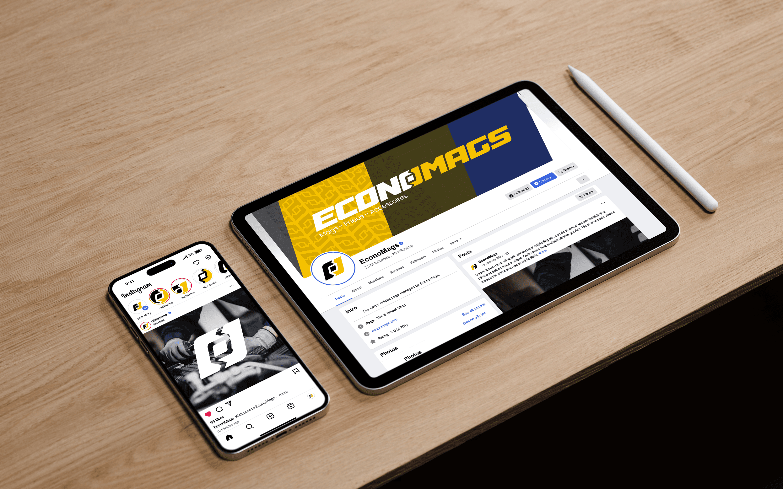
A style guide is not bureaucracy. It is the difference between a brand that compounds over time and a brand that resets every time someone new opens the files.
The guide exists to make the right decision the easiest decision available.
Systems
Guidelines
Systems
Consistency Is Cheaper
Every undocumented decision gets re-litigated. Guides remove the debate and quietly speed everything up.
Without documentation the brand lives in one or two people’s heads. Every new asset needs their approval, every approval needs a discussion, and every discussion costs time that had nothing to do with the actual work.
Documented systems invert that. Instead of asking whether a heading looks right, the team checks the scale and moves on. Designers stop rebuilding the same components, marketers stop waiting for sign-off, and the brand gets sharper because attention shifts from defending basics to improving them.
There is a compounding benefit as well. Consistency is what makes repetition possible, and repetition is what makes a brand recognisable. A guide is really a mechanism for keeping the same promise long enough to be believed.
The cost is easiest to see when someone leaves. If the person holding the brand in their head moves on and nothing is written down, the next hire begins reinterpreting from scratch, and the identity restarts at a lower quality than it ended.
Guides also protect against well-meaning erosion. Most off-brand work comes from people trying to help under time pressure. Give them a correct, easy option and they will take it; leave them guessing and they will improvise something reasonable and slightly wrong.
There is a credibility angle too. Clients, partners, and candidates all read consistency as competence. A company whose materials agree with each other looks like a company that has its operations in order, and that impression is formed long before anyone asks about process.
It is also the only realistic way to scale brand work beyond the founder. Agencies, freelancers, and new hires cannot infer your standards, and briefing each of them verbally is both expensive and inconsistent. A guide is the cheapest form of art direction you will ever produce.

What To Include
Logo use, type scale, colour tokens, spacing, imagery direction, and tone of voice — each with real examples rather than abstract rules.
Start with the elements that appear most often, not the ones that feel most precious. In most businesses that means typography, colour, spacing, and writing. Logo lock-ups matter, but they are used far less than a heading style or a button.
Give every rule a demonstration. Show the correct application beside a plausible wrong one and explain the reasoning in a sentence. People follow examples far more reliably than instructions, and understanding the reason means they can handle situations you didn’t anticipate.
Include tone of voice with actual rewrites: a paragraph before, the same paragraph after. Voice is the part of the brand most often left out of guidelines and most often the reason a brand feels inconsistent.
Spacing and layout rules deserve more space than most guides give them. Inconsistent rhythm is the single most common reason a brand looks amateur, and it is entirely preventable with a documented scale and a handful of layout patterns.
Include the awkward cases as well: what happens on a tiny screen, in a dense table, in an email client that strips your fonts, in a partner’s template you don’t control. A guide that only covers ideal conditions gets abandoned the first time reality intrudes.
Include a short section on what the brand is not, with examples. Negative examples are the fastest way to communicate a boundary, and they save the reviewer from having to explain the same correction repeatedly to different people.
Document tone of voice with a small vocabulary list as well: the words you always use, the words you never use, and the ones people keep getting wrong. It sounds trivial and it removes an enormous amount of repeated correction.


Keep It Alive
A guide that isn’t updated becomes a guide nobody trusts, and an untrusted guide is worse than none at all.
Assign an owner. Without a named person responsible for the system it drifts within two quarters, and the team learns that the document is optional.
Build a review rhythm — quarterly is usually enough. New patterns emerge from real work, and the guide should absorb them rather than pretend they don’t exist. Documenting what the team already does is often more valuable than prescribing what they should do.
Keep it where people already work: a shared library, a component set, a page they pass daily. The best guide is the one that is easier to follow than to ignore.
Version it visibly. A short changelog at the top telling people what changed and when builds far more confidence than a polished document with no history, because it proves someone is paying attention.
And keep it short enough to read. A focused twenty pages that people actually use beats an exhaustive hundred that nobody opens twice. Anything not being followed is either wrong or badly explained, and both are worth fixing.
Treat adoption as part of the job. Walk the team through it once, put it where they work, and answer questions in public so the answers accumulate somewhere useful. A guide nobody was introduced to is functionally a guide that does not exist.
Above all, keep it practical. Guides that read like manifestos get admired once and ignored afterwards. Guides that answer real questions — what size, which colour, what do I write here — get used weekly, and used is the only measure that matters.



FAQ
01
How does your brand design process work?
02
What's included in your branding packages?
03
Do you also design websites?
04
How long does branding take?
05
What do I need to prepare?
06
Do you offer ongoing support?
07
Can I make tweaks after delivery?
08
How do you ensure my brand stands out from competitors?
Let's Work Together
©2025
Contact Now
Book a discovery call
Let’s create something amazing together! Reach out I’d love to hear about your project and ideas.
or send a message
Jun 30, 2026
Why Your Brand Needs A Style Guide
A style guide is not bureaucracy. It is the difference between a brand that compounds over time and a brand that resets every time someone new opens the files.
The guide exists to make the right decision the easiest decision available.
Systems
Guidelines
Systems
Consistency Is Cheaper
Every undocumented decision gets re-litigated. Guides remove the debate and quietly speed everything up.
Without documentation the brand lives in one or two people’s heads. Every new asset needs their approval, every approval needs a discussion, and every discussion costs time that had nothing to do with the actual work.
Documented systems invert that. Instead of asking whether a heading looks right, the team checks the scale and moves on. Designers stop rebuilding the same components, marketers stop waiting for sign-off, and the brand gets sharper because attention shifts from defending basics to improving them.
There is a compounding benefit as well. Consistency is what makes repetition possible, and repetition is what makes a brand recognisable. A guide is really a mechanism for keeping the same promise long enough to be believed.
The cost is easiest to see when someone leaves. If the person holding the brand in their head moves on and nothing is written down, the next hire begins reinterpreting from scratch, and the identity restarts at a lower quality than it ended.
Guides also protect against well-meaning erosion. Most off-brand work comes from people trying to help under time pressure. Give them a correct, easy option and they will take it; leave them guessing and they will improvise something reasonable and slightly wrong.
There is a credibility angle too. Clients, partners, and candidates all read consistency as competence. A company whose materials agree with each other looks like a company that has its operations in order, and that impression is formed long before anyone asks about process.
It is also the only realistic way to scale brand work beyond the founder. Agencies, freelancers, and new hires cannot infer your standards, and briefing each of them verbally is both expensive and inconsistent. A guide is the cheapest form of art direction you will ever produce.
What To Include
Logo use, type scale, colour tokens, spacing, imagery direction, and tone of voice — each with real examples rather than abstract rules.
Start with the elements that appear most often, not the ones that feel most precious. In most businesses that means typography, colour, spacing, and writing. Logo lock-ups matter, but they are used far less than a heading style or a button.
Give every rule a demonstration. Show the correct application beside a plausible wrong one and explain the reasoning in a sentence. People follow examples far more reliably than instructions, and understanding the reason means they can handle situations you didn’t anticipate.
Include tone of voice with actual rewrites: a paragraph before, the same paragraph after. Voice is the part of the brand most often left out of guidelines and most often the reason a brand feels inconsistent.
Spacing and layout rules deserve more space than most guides give them. Inconsistent rhythm is the single most common reason a brand looks amateur, and it is entirely preventable with a documented scale and a handful of layout patterns.
Include the awkward cases as well: what happens on a tiny screen, in a dense table, in an email client that strips your fonts, in a partner’s template you don’t control. A guide that only covers ideal conditions gets abandoned the first time reality intrudes.
Include a short section on what the brand is not, with examples. Negative examples are the fastest way to communicate a boundary, and they save the reviewer from having to explain the same correction repeatedly to different people.
Document tone of voice with a small vocabulary list as well: the words you always use, the words you never use, and the ones people keep getting wrong. It sounds trivial and it removes an enormous amount of repeated correction.
Keep It Alive
A guide that isn’t updated becomes a guide nobody trusts, and an untrusted guide is worse than none at all.
Assign an owner. Without a named person responsible for the system it drifts within two quarters, and the team learns that the document is optional.
Build a review rhythm — quarterly is usually enough. New patterns emerge from real work, and the guide should absorb them rather than pretend they don’t exist. Documenting what the team already does is often more valuable than prescribing what they should do.
Keep it where people already work: a shared library, a component set, a page they pass daily. The best guide is the one that is easier to follow than to ignore.
Version it visibly. A short changelog at the top telling people what changed and when builds far more confidence than a polished document with no history, because it proves someone is paying attention.
And keep it short enough to read. A focused twenty pages that people actually use beats an exhaustive hundred that nobody opens twice. Anything not being followed is either wrong or badly explained, and both are worth fixing.
Treat adoption as part of the job. Walk the team through it once, put it where they work, and answer questions in public so the answers accumulate somewhere useful. A guide nobody was introduced to is functionally a guide that does not exist.
Above all, keep it practical. Guides that read like manifestos get admired once and ignored afterwards. Guides that answer real questions — what size, which colour, what do I write here — get used weekly, and used is the only measure that matters.
FAQ
01
How does your brand design process work?
02
What's included in your branding packages?
03
Do you also design websites?
04
How long does branding take?
05
What do I need to prepare?
06
Do you offer ongoing support?
07
Can I make tweaks after delivery?
08
How do you ensure my brand stands out from competitors?
Let's Work Together
©2025
Contact Now
Book a discovery call
Let’s create something amazing together! Reach out I’d love to hear about your project and ideas.
or send a message
Jun 30, 2026
Why Your Brand Needs A Style Guide
A style guide is not bureaucracy. It is the difference between a brand that compounds over time and a brand that resets every time someone new opens the files.
The guide exists to make the right decision the easiest decision available.
Systems
Guidelines
Systems
Consistency Is Cheaper
Every undocumented decision gets re-litigated. Guides remove the debate and quietly speed everything up.
Without documentation the brand lives in one or two people’s heads. Every new asset needs their approval, every approval needs a discussion, and every discussion costs time that had nothing to do with the actual work.
Documented systems invert that. Instead of asking whether a heading looks right, the team checks the scale and moves on. Designers stop rebuilding the same components, marketers stop waiting for sign-off, and the brand gets sharper because attention shifts from defending basics to improving them.
There is a compounding benefit as well. Consistency is what makes repetition possible, and repetition is what makes a brand recognisable. A guide is really a mechanism for keeping the same promise long enough to be believed.
The cost is easiest to see when someone leaves. If the person holding the brand in their head moves on and nothing is written down, the next hire begins reinterpreting from scratch, and the identity restarts at a lower quality than it ended.
Guides also protect against well-meaning erosion. Most off-brand work comes from people trying to help under time pressure. Give them a correct, easy option and they will take it; leave them guessing and they will improvise something reasonable and slightly wrong.
There is a credibility angle too. Clients, partners, and candidates all read consistency as competence. A company whose materials agree with each other looks like a company that has its operations in order, and that impression is formed long before anyone asks about process.
It is also the only realistic way to scale brand work beyond the founder. Agencies, freelancers, and new hires cannot infer your standards, and briefing each of them verbally is both expensive and inconsistent. A guide is the cheapest form of art direction you will ever produce.
What To Include
Logo use, type scale, colour tokens, spacing, imagery direction, and tone of voice — each with real examples rather than abstract rules.
Start with the elements that appear most often, not the ones that feel most precious. In most businesses that means typography, colour, spacing, and writing. Logo lock-ups matter, but they are used far less than a heading style or a button.
Give every rule a demonstration. Show the correct application beside a plausible wrong one and explain the reasoning in a sentence. People follow examples far more reliably than instructions, and understanding the reason means they can handle situations you didn’t anticipate.
Include tone of voice with actual rewrites: a paragraph before, the same paragraph after. Voice is the part of the brand most often left out of guidelines and most often the reason a brand feels inconsistent.
Spacing and layout rules deserve more space than most guides give them. Inconsistent rhythm is the single most common reason a brand looks amateur, and it is entirely preventable with a documented scale and a handful of layout patterns.
Include the awkward cases as well: what happens on a tiny screen, in a dense table, in an email client that strips your fonts, in a partner’s template you don’t control. A guide that only covers ideal conditions gets abandoned the first time reality intrudes.
Include a short section on what the brand is not, with examples. Negative examples are the fastest way to communicate a boundary, and they save the reviewer from having to explain the same correction repeatedly to different people.
Document tone of voice with a small vocabulary list as well: the words you always use, the words you never use, and the ones people keep getting wrong. It sounds trivial and it removes an enormous amount of repeated correction.
Keep It Alive
A guide that isn’t updated becomes a guide nobody trusts, and an untrusted guide is worse than none at all.
Assign an owner. Without a named person responsible for the system it drifts within two quarters, and the team learns that the document is optional.
Build a review rhythm — quarterly is usually enough. New patterns emerge from real work, and the guide should absorb them rather than pretend they don’t exist. Documenting what the team already does is often more valuable than prescribing what they should do.
Keep it where people already work: a shared library, a component set, a page they pass daily. The best guide is the one that is easier to follow than to ignore.
Version it visibly. A short changelog at the top telling people what changed and when builds far more confidence than a polished document with no history, because it proves someone is paying attention.
And keep it short enough to read. A focused twenty pages that people actually use beats an exhaustive hundred that nobody opens twice. Anything not being followed is either wrong or badly explained, and both are worth fixing.
Treat adoption as part of the job. Walk the team through it once, put it where they work, and answer questions in public so the answers accumulate somewhere useful. A guide nobody was introduced to is functionally a guide that does not exist.
Above all, keep it practical. Guides that read like manifestos get admired once and ignored afterwards. Guides that answer real questions — what size, which colour, what do I write here — get used weekly, and used is the only measure that matters.
FAQ
How does your brand design process work?
What's included in your branding packages?
Do you also design websites?
How long does branding take?
What do I need to prepare?
Do you offer ongoing support?
Can I make tweaks after delivery?
How do you ensure my brand stands out from competitors?
Let's Work Together
©2025
Contact Now
Book a
discovery call
Let’s create something amazing together! Reach out I’d love to hear about your project and ideas.
or send a message